
GRANULES – Pancha Diya Oil Packaging Design
The Challenge
Create a packaging design that clearly communicates the product's traditional purpose and devotional positioning while ensuring essential product information, usage instructions, quantity, and regulatory details remain easy to read across multiple packaging panels.
Our Solution
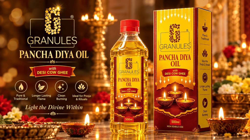
Developed a warm, traditional packaging system using maroon and golden-yellow tones to create a premium devotional appearance. Multiple diya illustrations were incorporated to immediately communicate the product's intended use, while decorative borders and structured information panels maintain consistency across the complete carton layout. The artwork was prepared as a complete packaging dieline, covering the front, back, side panels, top flaps, bottom structure, product information, barcode, and print specifications.
Key Results
Strong devotional product identity • Complete carton packaging system • Clear information hierarchy • Traditional visual language • Print-ready dieline artwork • Consistent branding across all panels • Shelf-ready presentation
Answers to Common Questions Across Our 8 Capabilities
High-impact technical and strategic specifications covering our enterprise AI, software, web engineering, branding, and digital growth services.